Monday, February 11, 2019

Watercolor Painting Demonstraton: A Sunset View of the Blue Ridge Mountains in a Narrated Time-Lapse Video Tutorial


Sunset in the Blue Ridge Mountains, A Watercolor Painting Tutorial

This week I recorded a time-lapse video while I created a landscape watercolor painting step-by-step, from beginning to end. During each step of the tutorial/demonstration, I narrated my process to help you learn how to paint better watercolor paintings. The demo covers creating a watercolor sunset glow in a landscape, painting layers of mountain ranges, painting a figure into a landscape, and using shadows to make your painting stand out. 

I set the mood with some relaxing piano music so you can feel soothed while you learn to paint with watercolors, or simply enjoy watching the painting come to life.

To take things a step further, I also included a note at the end of the time-lapse (and at the end of this post) with the names of all of the paints that I used while painting this demo, including brand names and pigment codes. Why do I include brand names and pigment information? Because watercolor pigments often vary among manufacturers. That's not to say one is better than another, but they are different and will look and behave differently. Sometimes brands will sell the same pigment under different names, as well, so I've learned to always know what pigments are in my watercolor paint tubes, and not just the name of the color!


This painting is available for sale in my Etsy Shop.


Colors Used in this Painting

Cobalt Blue – PB 28 – American Journey
Ultramarine Blue – PB 29 – American Journey
Joe's Red – PR 254 – American Journey
Pyrrol Crimson – PR 264 – Daniel Smith
Quinacridone Gold – PO 49 – Daniel Smith
Transparent Red Oxide – PR 101 – Daniel Smith
Sepia – PBk + PBr 7 – American Journey


Monday, October 1, 2018

A Watercolor Time-Lapse Video—My first!


Last week recorded my first-ever watercolor painting demo video and uploaded it onto my YouTube channel as a time-lapse video. It was fun to do and a bit exciting to see the result!

I painted this watercolor demonstration in about 30 minutes and the time-lapse video of the painting process ended up being just under 3 minutes.  The painting is a landscape of the Blue Ridge Mountains with green tree branches in the foreground. I plan to create more watercolor painting videos in the future, so I'm definitely interested in hearing what kind of demos and paintings fans of my art would like to see!

As is always the case when I try something new, I learned a lot from my first watercolor demo video. For instance, the work is far from over when you're finished recording the video. I gained a lot of new video-editing skills as I learned to adjust cropping, lighting, and colors in Photoshop CS6 (luckily it's very much the same as editing photos, once you learn the ins and outs of working with videos in Photoshop), as well as how to create and join other video clips and images together. It was so much fun and I can't wait to do more with my new abilities!

So after you watch the video below, please leave your thoughts in the comments. Let me know how I'm doing so far and what you'd like to see in the future!


Sunday, September 10, 2017

Color Reference for Watercolors: How to Create Your Own Guide

It's been a loooong time since I posted anything here on my blog. Ok, almost three years. But a lot of people ask me why I stopped blogging, and tell me that I've helped them, so I'm going to try to get back into the habit. Here is something that I find really useful and I decided to share.
 
The more you know about the watercolors on your palette, the better. If you have all of their properties in your head, you can make much faster and better decisions as to how to use them. And it's fun to play with them anyway, so that's a bonus. Watercolor paints are made of pigments suspended in a water-based solution, and the various pigments have different qualities. The most obvious variation is the color, or hue, but there are other variations, such as transparency, permanence, and value. Knowing how to expect your pigments to behave is a crucial step in learning to create better watercolor paintings.

To create my guide, I started by cutting out a long, thin piece of watercolor paper. Mine is about 3 x 7 inches, but the length of yours will depend on how many different colors you intend to test. If you're not sure, you can just cut more paper than you need, and trim off the excess later. Next, I drew a thick vertical line with a black sharpie about 1/4 of the way over from the left edge of the paper. This line will help you learn about the transparency of your watercolor pigments.

The next step is to mix small puddles of your chosen colors. Each of your puddles (or washes) should be about the same consistency. You don't want any of them to be significantly thicker or thinner than the others. You can mix them one-by-one or all at once, just as long as they are pretty consistent. Dip one of your smaller brushes into the first puddle, and carefully paint a steady line of color across the black line. Make the lines of color long enough to be able to create another vertical line to the right of the black one (you'll find out why in a minute). Continue this process with each of your colors, making sure to thoroughly rinse your brush after each stroke. I chose to go in order of colors because it makes it so much easier for me to compare similar hues. As you go, label your colors with a fine-tipped pen, so you don't forget what any of them are. Once you have painted all of your colorful lines, let them air dry. (You may use a hairdryer to speed things up.)

For the final step, take a stiff-bristled brush, get it good and wet (not dripping), and use it to scrub away some of the paint. Start at the top, and make a vertical "scrubbing" line all the way to the bottom. Try to use the same amount of pressure and scrubbing all the way down the paper, so you don't end up with some colors that were scrubbed more than others. When you get down to the bottom, use a tissue or dry paper towel to blot up the water and lifted paint. Any old brush with stiff hair will work for this step, as long as you don't mind abusing it. I like to use the Fritch Scrubber brushes made by Cheap Joe's Art Stuff (no paid affiliation, but they are an awesome company; their owner, Joe, is a true friend to artists everywhere). They sell a few different sizes and I use them in my own paintings all the time. The scrubbing teaches you about the permanence of your pigments. As you can see in Example A., some of the colors will readily disappear, while others are certain that they are here to stay.

At this point you will have a reference guide that will tell you a lot about your watercolors. However, I decided to go one step further. I made a black and white copy of my chart (Example B). What is the purpose? Well, it helps me see the inherent differences in value that each of the colors have. As you probably know, you can make your colors darker or lighter in value by adding less or more water to the paints, but some colors are simply lighter or darker than others. A good example is yellow, which, by itself, will never be able to be a dark value.

Ever since I made my own guide, I find that I use it all the time. No matter how well I think I know my paints, it's great to have all of the information right there in front of me when making important painting decisions. I've pinned both pieces of paper right on my studio wall for easy reference.

Thanks for reading! If you found this article useful, please comment, follow and/or check out my other posts!

Laura

Wednesday, November 5, 2014

Making Note Cards: Cutting, Folding, and Packaging

"Summer Birds" note cards by Laura D. Poss    A few years ago I wrote a series of blog posts about making note cards from your art. In those articles I discussed reasons to make note cards and what materials I use to make mine. Today I'm going to go into a little more detail about each of the steps I use to make the cards.


Step 1: I print my cards 8 1/2 x 11-inch card stock, and two are printed on each page, so the first step is to cut each page in half. Using my paper trimmer, I set my guide at 5 1/2 inches, and slice each page down the middle as shown below.


Step 2: The next step is to create a fold down the middle of each card to create a front, inside, and back of the card. Whether your cards are oriented horizontally (as shown) or vertically, the fold will be in the same spot. I use my paper trimmer and an 8" plastic bone folder (available online or at most craft stores) to make a neat, clean fold.
   To do this, I lay the paper face-down on the trimmer, with the image closest to the back of the trimmer. Then, I use the back of the trimmer to hold the paper in place as I fold the card in half and line up the edges. Next, I use the bone folder to press down on the folded edge and make a firm, neat crease. 

Beginning the crease in the middle of the fold.
Using the bone folder to finish creasing the paper all the way across the folded side of the card.


  As you can see in the background of the photos above, I am making a large stack of cards, folding them one at a time. I am also separating them into packs of 8 cards as I go, by turning each pack-stack a different direction from the pack-stack below.


Step 3: The next step for me is to assemble the rest of my supplies. I count out my envelopes into stacks of 8, to go with my packs of 8 cards. The boxes I use come from clearbags.com, and they arrive packaged flat, so I also need to fold all of my boxes before I start packaging the cards. I leave one end of the boxes open to slide the stacks of cards and envelopes in. I also print backing sheets (shown in the lower left corner of the photo below) to place in my finished packs of note cards. I make a variety of different packs of cards with assorted images inside, so the backing sheets show you what assorted images are in each pack. I also print price tags to put on the front of the cards, using address labels made for home printers. And, finally, I have round stickers that I use to seal the ends of the boxes (they come with the boxes from clearbags.com), and stick-on hang-tabs from Firefly Solutions that I use to hang the finished packs of cards on my display rack.

Items shown, clockwise from upper left corner: White note card envelopes, folded note cards, two stacks of clear boxes, a printed sheet of price labels, with stickers and hang-tabs on top, and a stack of printed backing sheets.

Step 4: Once I have all of my supplies together, I begin creating the final product. To fill the boxes, I stack the contents (8 note cards, 8 envelopes, and a backing sheet), with one image showing on the front of the pack and the backing sheet showing through on the back and slide them into the boxes. Sometimes they try to get a little hung up on the flap seal at the far end of the pack, and when this happens, I just use my bone folder to help slide the contents in the pack more easily. 

Back side while assembling packs of cards.


One pack at a time goes pretty quickly at this stage! 


Step 5: The final step for me is to add all of the stick-ons to the outsides of the boxes. Clear round stickers go on the ends to help keep the flaps sealed, price stickers go on the front top corners, and the hang-tabs stick on to the top center of the backsides. The hang-tabs are very strong and cannot come off of the pack without damaging it, so place carefully!

The final product!

    So that's how I do it! I hope that if you are trying to make your own cards, that my methods can help you get started. If you already make your own, I'd love to hear any comments you have about ways to improve the method!

I also hope that some of the lovely folks who have been buying and using my note cards for years will enjoy seeing a "behind the scenes" look at my process. All of my cards are made using these techniques in my home workshop. The cards are printed on super-smooth archival card stock, and they are a joy to write on! I sell many types of note cards on my website, LauraPoss.com, and in my Etsy shop.

Comments? I want to hear them, and I'll do my best to answer any questions! Thanks for reading!

Laura

Monday, October 1, 2012

Behind the scenes- The Four Seasons

This week I decided to paint four 5x7-inch watercolors to depict the four seasons. 

When I do art shows I have a few framed sets of four giclées that I offer, and people always ask me if I have one that has all four seasons in it. I'm very happy to say that I no longer have to tell them, "I'm sorry, but no." 

I decided to do the same landscape in each painting, but to make it appear to have been done from slightly different distances and angles, as if they were done at four different times. Today I'm not going to show you step-by-step painting steps for my watercolors, but I'm going to share with you some of the planning that went into these paintings. 


I started with this little value sketch that I did in Glen Ayre, NC last year. 


From this sketch I created four new value drawings depicting what the four seasons might look like in this location. These were to be used as plans for the four completed paintings, and were done slightly smaller than the completed paintings.


I also made a plan for the colors I would use in each scene.


I decided to make each painting 5x7 inches. I taped town four pieces of paper and drew in the outline of each scene. Two of them are upside down in the photo because I wanted to be able to work on each of them without leaning over the others.


And here are the completed paintings! I used American Journey paints from Cheap Joe's Art Stuff for the most part, as well as transparent oxide red and quinacridone gold from Daniel Smith.


Winter

Spring

Summer


Autumn


I will also make giclée prints of these paintings and offer them as framed sets in a vertical format. I hope you enjoyed seeing a little bit of the planning that went into my "Seasons" paintings! 

Once you leave your comments below please Like my Page on Facebook!!

You can also see more artwork on my website at www.LauraPoss.com 

Wednesday, May 23, 2012

Four Little Birds- A Commissioned Project

Near the end of last year I painted four little winter bird watercolor paintings that were each 8 x 10 inches. I made giclée reproductions of my little bird paintings and began offering them in a few different sizes.
In the smallest sized giclee, which is 3 ½ x 5 inches, I started framing and selling the four little birds together as a vertical set. The four birds look really nice in the small size, and all grouped together.
watercolor bird paintings
Clockwise from top left they are a Carolina Chickadee, Carolina Wren, Tufted Titmouse, and Northern Cardinal.
  Then, at an art show last April, I had a customer come in to my booth who wanted the original bird paintings, but he wanted them in the small size and he wanted them framed together like the set of giclées. So he commissioned me to paint four original watercolors, based on my own 8x10-inch paintings, but only 3½ x 5 inches each. Of course, I agreed! And I took photos of the process and will now share them with you..


watercolor bird paintings
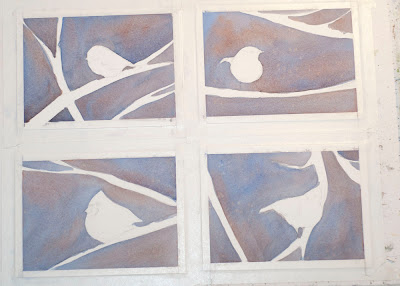
First I trimmed my watercolor paper to the correct sizes, and then taped them all to my gatorboard. I penciled in the bird shapes and the main branches, then started with loose washes of transparent oxide red (Daniel Smith) and cobalt blue (American Journey) to create the soft background.


watercolor bird paintings
 I continued laying in washes of the same colors in the background, and sprinkled some salt into the wet paint here and there to create texture and the appearance of background snowflakes. I chose to do the background in multiple layers to create depth with the overlapping shades. Once I was satisfied with the background washes, I used a fritch scrubber brush to lift out the shapes of the lighter background branches and  foreground snowflakes. I also laid in the first appearance of color on the bodies of the birds and foreground branches.


watercolor bird paintings
I continued painting the colors of the birds and foreground branches, using the same technique of layering washes, letting each wash dry in between. (A hairdryer helps to speed this along.)And here you can see the four watercolor paintings completed and signed, but still taped to the gatorboard. Note-at the end I used a white gel pen to add some of the white detail on the cardinal's wing.


Framed and ready to go!

 My husband, John made a lovely frame for the little birds, and double matted them with a black inner mat and a speckled off-white outer mat.
And now these little guys are being shipped to their new home in the state of Maine!


Thank you for reading my blog and I hope you find it helpful!

When you're done leaving your comments/questions below, please check out my facebook page, and click "Like" if you do!